UX Research
UI Design
Branding
Role Designer
Context Shillington Course
Platform Mobile App

Overview
GiftWell is a mobile application designed to make group gifting joyful and effortless. The app allows friend groups to create gifting events, collectively vote on the best gift option, and split costs, all within a single, intuitive flow.
The project spans the full design lifecycle: from identifying a real user pain point, through research and ideation, to wireframing, visual design, brand identity, and high-fidelity prototyping. The result is a product that transforms a typically stressful coordination process into a delightful shared experience.
Research
Through early research conversations and observations, three core user frustrations emerged repeatedly. The experience of organizing a group gift is almost universally stressful, even though it's a common social ritual. No dedicated platform handles the full arc of the experience end to end.
01
pain point
Too many choices, no structure to decide
Users are overwhelmed by the open-ended nature of gift selection. Without a curated set of options, the decision becomes a source of anxiety rather than joy — and the group often defaults to a gift card out of exhaustion.
02
pain point
Coordination overhead across multiple people
Managing responses, collecting money, and aligning on a decision across a group requires constant back-and-forth messaging. The logistics overshadow the sentiment — by the time the gift is decided, the effort has drained the joy out of giving it.
03
pain point
Impersonal outcomes from a broken process
When the process is chaotic, the gift suffers. Without a structured decision flow, groups default to generic options that lack the personal touch of a considered gift — undermining the social purpose of gifting altogether.

UX DEsign
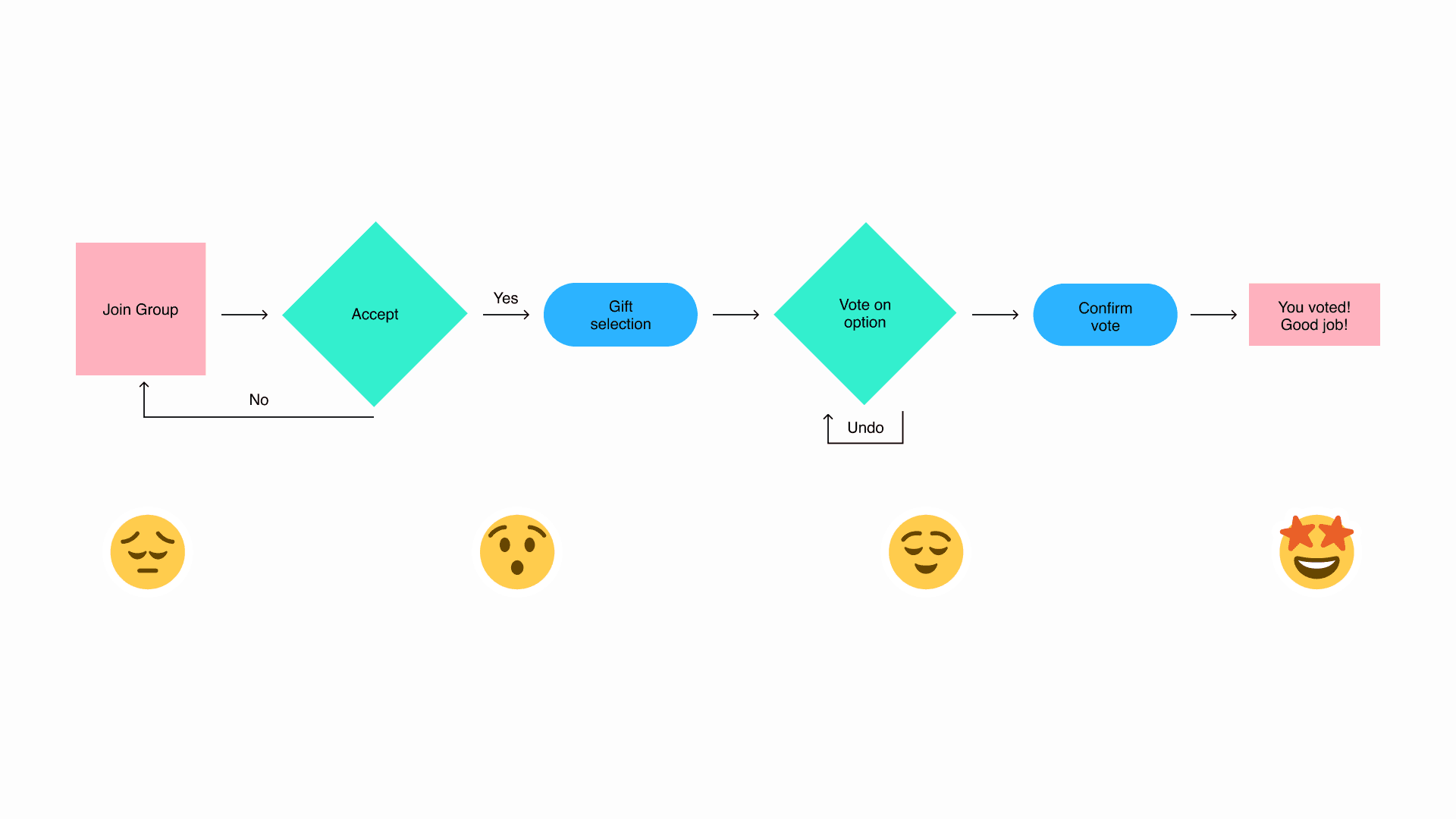
The GiftWell core flow follows a linear, four-stage progression with one intentional decision point and one undo escape hatch. Each stage is designed to reduce friction and move the user forward with confidence — never asking them to make a decision they're not ready for.
01
stage
Join Group — Accept or decline the invitation
The user receives an invitation to join a gifting group for a specific event. A clear accept/decline decision point keeps the user in control from the first interaction. Declining loops back to the group screen; accepting moves the flow forward.
02
stage
Gift Selection — Browse a curated shortlist
Rather than open-ended search, users are presented with a curated list of gift options — each with an image, description, and per-person cost. Constraining the choice set reduces cognitive load and creates positive surprise at the quality of options.
03
stage
Vote — Single selection with an undo escape hatch
The user selects their preferred gift. Single selection keeps the decision simple and unambiguous. An Undo option is available for users who change their mind — because irreversible actions create anxiety, and the ability to reconsider creates confidence.
04
stage
Confirm — Recognition before the result
Upon confirming their vote, users see a full-screen "Thank You" animation before the group result is revealed. The moment of acknowledgment is intentional — it makes participating feel worthwhile, not transactional.
😔
Join Group
Uncertain / FOMO
The user may not know what to expect or whether to participate at all.
😮
Gift Selection
Surprised / Engaged
The quality and curation of options creates genuine positive surprise.
😌
Vote Confirmed
Relieved / Satisfied
The act of deciding — and having it acknowledged — brings closure.
🤩
Results
Delighted / Excited
Knowing the group's decision and having contributed to it creates joy.
Design decisions
01
decision
Linear progression removes the option to hesitate
Users cannot skip steps or make out-of-order decisions. This constraint is intentional — it removes decision paralysis by removing optionality. Each screen has one clear next action, and the flow carries the user forward.
02
decision
Emotional payoff after every meaningful action
After submitting a vote, users see a full-screen "Thank you for your vote" animation. This is not decorative — it acknowledges the user's contribution and makes the act of participating feel worthwhile. Consumer social products live and die by moments like this.
03
decision
Undo as a trust-builder, not an afterthought
The undo branch at the voting step was added on the principle that users should always feel in control. It's available but not prominent — a safety net that reduces anxiety without distracting from the primary path.
04
decision
Positive reinforcement echoes the brand voice
The final state uses celebratory, warm language that mirrors the occasion itself. The copy and visual design work together to ensure the product feels like a celebration — not a logistics tool with a nicer coat of paint.
wireframes
Low-fidelity wireframes were created to validate the core UX logic of the voting flow — focusing on information hierarchy, interaction states, and the key screens in the participant journey before any visual design decisions were made.
01
Insight
Single-select is sufficient
The single-select interaction model was validated as sufficient for this use case. Users did not need multi-vote capability — one clear choice per participant produces cleaner group results and less post-decision anxiety.
02
insight
Avatar display on results builds group accountability
Showing who voted for each option on the results screen acts as a social proof mechanism. It creates group accountability and turns the result reveal into a shared social moment rather than a cold announcement.

ui design
The final high-fidelity UI applies GiftWell's full visual language to the wireframed flow. Each screen combines functional clarity with brand expressiveness — every state is designed to feel both useful and joyful.

01
Screen
Gift Voting — Unselected state
Gift options are displayed as cards in a scrollable list — each showing a gift photo, name, brief description, per-person cost, and total cost. The Submit button is disabled and visually de-emphasized until a selection is made, preventing premature progression.
01
screen
Gift Voting — Selected state
On selection, the chosen card receives a clear active state. The Submit button simultaneously activates — changing from grey to vivid purple — signaling readiness to proceed. The contrast is intentional and high-contrast for accessibility across all users.
01
Screen
Thank You — A full-bleed celebration moment
The post-vote screen is a full-bleed celebration. The "Change your mind? There's still time!" escape link sits below — styled as a text link, not a button, so it's present without competing for attention.
01
screen
Results — The group's decision, revealed
The results screen reveals the winning gift with avatar display showing who voted for each option. The primary CTA "Contribute to gift" converts the group's shared decision into a collective payment — the natural next action.
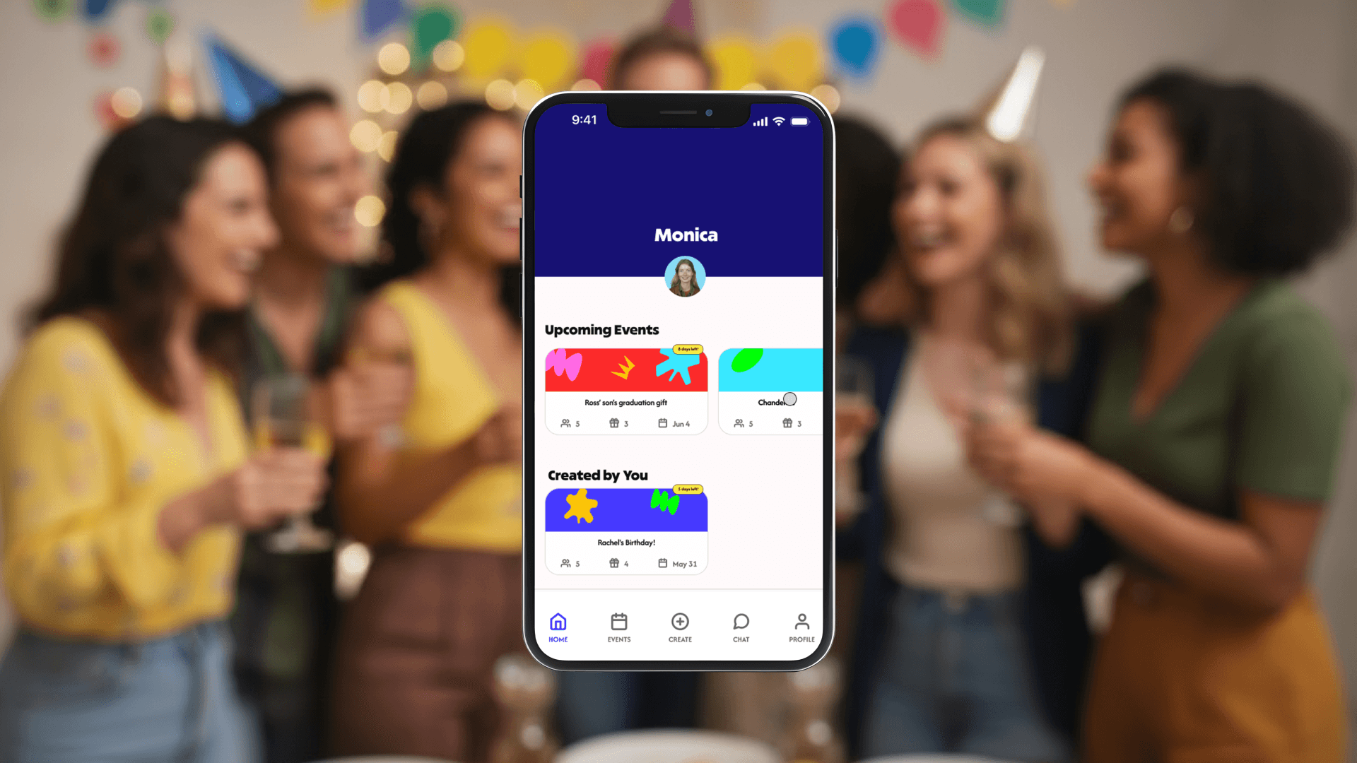
Home Screen — Event cards use the illustration system to generate unique visual identities per event, with countdown badges that create gentle urgency without anxiety.
brand identity
GiftWell needed a brand identity that could carry the emotional weight of the product — simultaneously energetic and trustworthy, playful but not childish, celebratory but accessible.
The central design metaphor is the handwrapped gift. Wrapping a gift by hand is intentional, personal, and visible in its effort. Every step of the GiftWell experience is crafted to feel deliberate and warm — not transactional. The brand identity, illustration system, and copy voice all reinforce this same quality.

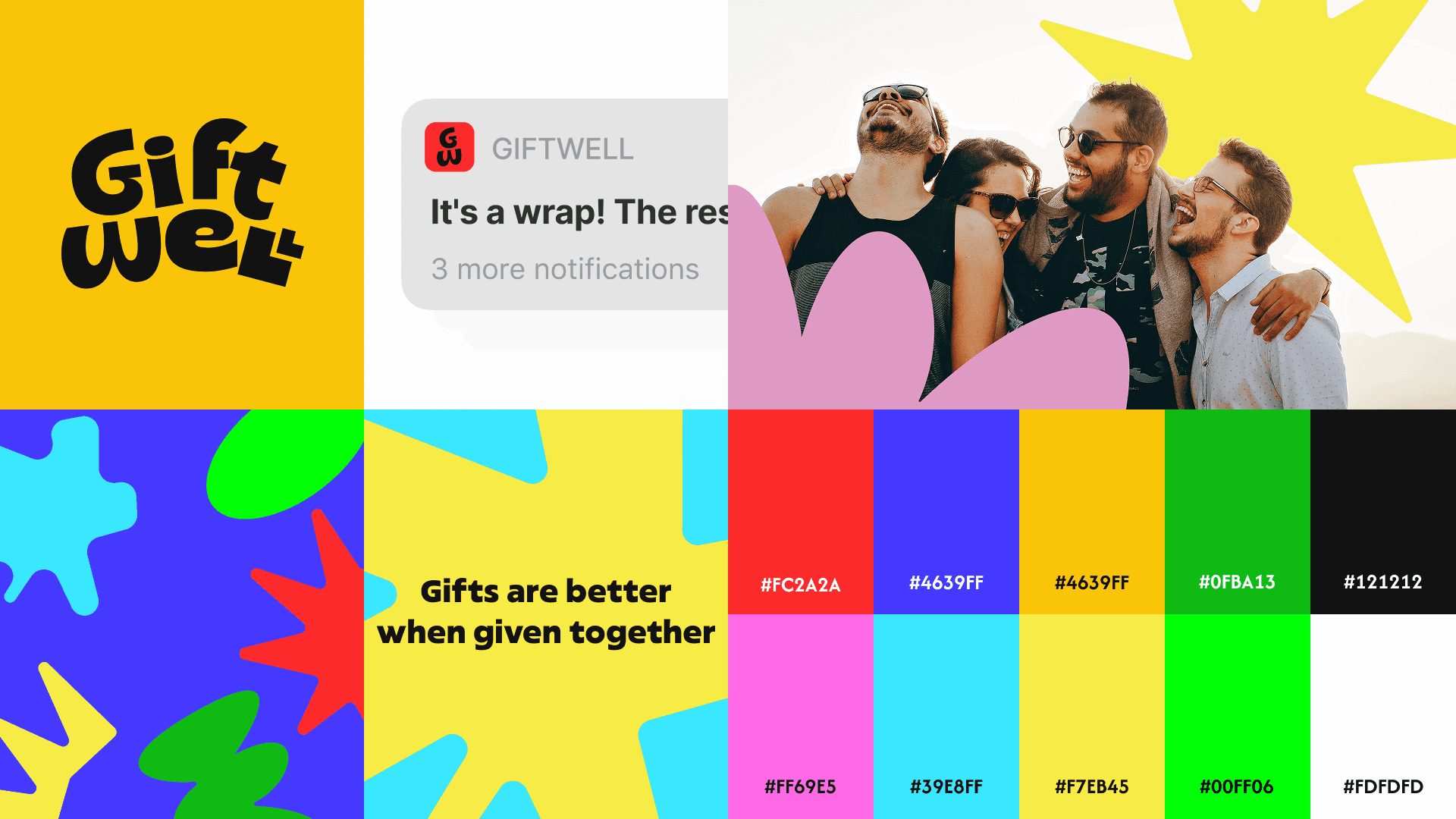
The color palette uses a full spectrum of vivid saturated hues. The illustration system — stars, blobs, crowns, splats, and bows — references the handcrafted quality of gift wrapping, and ensures no two event cards ever look the same.


Brand Application
The identity extended beyond the screen
A strong product brand extends beyond the app itself. GiftWell's identity was applied to multiple real-world and digital touchpoints to demonstrate the brand's flexibility and depth across contexts.

Physical gift wrap and companion sticker sheets reinforce the handwrapped concept. A brand extension and a conceptual loop: GiftWell, the app about gifting, produces actual gift wrap.
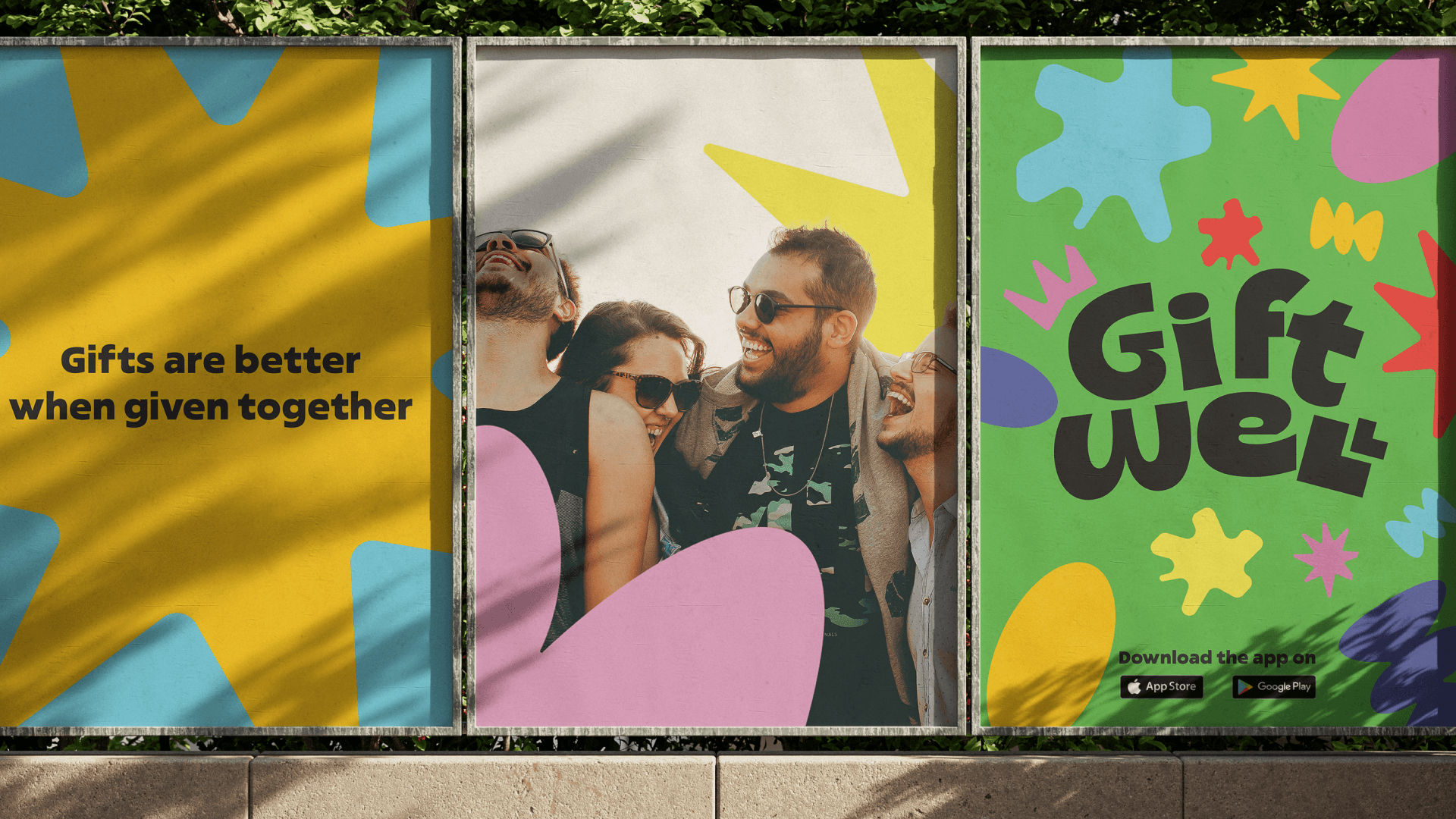
A three-panel outdoor advertising mockup demonstrates the brand's visual impact at scale — message panel, photography panel, and logo/CTA panel working together as a single billboard-scale statement.

GiftWell's playful notification copy transforms a routine lock-screen touch point into a moment of brand personality — treating it as an opportunity, not a utility.
Outcomes
What this project delivered and where it goes next
01
Reduces group gifting coordination from days of back-and-forth messaging to a single timed voting event.
02
Removes the social awkwardness of money conversations through transparent, upfront per-person cost displa.
03
Creates a product experience that matches the emotional register of its use case — joyful, social, and celebratory.
04
Builds a brand identity that is immediately distinctive and ownable in a market full of generic-looking social apps
Key Learnings
Structuring a decision — voting from a curated list — is often more effective than enabling open-ended input. Price transparency in social payment contexts is a primary trust signal, not a secondary concern. In consumer social products, the visual and emotional design is as important as the functional design. And brand is not a layer applied on top of UX — the illustration system, color palette, and copy voice all reinforce the product's core value proposition from the inside out.
Future Directions
→ An integrated payment flow for seamless cost-splitting directly within the app.
→ A gift recommendation engine that surfaces suggestions based on the recipient's interests.
→ Group chat for post-vote coordination and celebration after the decision is made.
→ A recipient reveal screen that creates a shared moment when the gift is confirmed.
→ API integrations with gifting retailers to enable direct in-app purchase without leaving the experience.